Fonts in children books - Typography
Typography for children
Children learn reading letter by letter slowly putting them together to discover the hidden meanings. Each letter is new and important. The typeface for children's books should be friendly, inviting and simple and the letters should be big enough for them to read. The preferable shape of the letters is rounded. The text should be easy to read and long lines of text and all capital letters should be avoided. When children read, their eyes are not yet trained enough to jump from the end of one line to the beginning of the next one. Therefore, enough space should be left for them to find the next part with greater ease. The five main characteristics that are usually attributed to topography for children are:
- high x-height, which is the distance between the baseline and the top of the lower case line in a typeface; taller letters are more readable
- large counters, which means that the empty spaces within the letters are big and make the letters easy to read
- wide bracketed serifs, that is the endings of letters that connect the stems are wide; the more pronounced they are the easier it is for a child to differentiate one letter from others
- double story allographs, which refers to variants of letters that take up more space and who thus differ from other letters and
- moderate contrast in stroke variation.
The format of the book, the size of the letters, the amount of white space and the illustrations indicate what age group the book is intended for.
In my book, the font is intended for adults as the text is too long for an inexperienced eye of a child to follow. Producing the book, and especially the text, I focused on the parents who would be reading the story to the children, disregarding the fact that those young readers might be eager to follow the words. This experience has taught me that I need to be more mindful of the needs of my target audience and consider all the aspects before I submit a finished product.
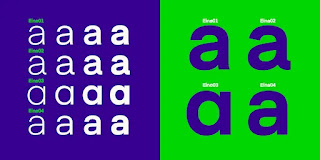
For my book I used Eina 01 Semi Bold font.
Eina 01 it is versatile and multipurpose sans- serif typeface, consisting of 32 original styles, organized into four categories: humanist, rational, industrial and geometric.
Eina 01
Eina 01
Choosing the right font for my book was daunting experience. Knowledge about Typography is a crucial for Graphic Designers. Letters should be easy-to-read typefaces , set in the most readable way and grab the viewer's attention.
6. Woodford Bourne
10. Lilly
11. Short Stack
Best free Fonts for Children's books:
1. Quicksand
2. Caroni
4. Linotte
5. Spilt Ink
10. Lilly
12. Playtime With Hot Toddies
The easiest fonts for kids to read:
- Sasson Primary
- Gill Sans Infant
- Bembo Infant
- Platin Infant
- Andika - Free Google Font
- Futura
- KG Neatly Printed Font
Reference:
Fonts (n.d.) Typography for Children [online] Available from: https://www.fonts.com/content/learning/fyti/situational-typography/typography-for-children [ Accessed: 03.06.2022]
Varro Joanna (2020) The easiest fonts for kids to read [online] Available at: https://varrojoanna.com/the-easiest-fonts-for-kids-to-read/ [Accessed:03.06.2022]
Type- ed (n.d.) The Typography of Children's books [online] Available at: https://type-ed.com/resources/rag-right/2016/10/03/typography-childrens-books [Accessed: 03.06.2022]
Typotheque (1999-2022) Specific Font Questions [online] Available at: https://www.typotheque.com/help/specific_font_questions/x-height [ Accessed: 03.06.2022]
Reference / Reference image:
In Design Skills (2022) The best free fonts for Children's book available at: https://indesignskills.com/inspiration/free-fonts-childrens-books/ [ Accessed: 03.06.2022]
Varro Joanna (2020) The easiest fonts for kids Available at: https://varrojoanna.com/the-easiest-fonts-for-kids-to-read/ [ Accessed: 03.06.2022]


This is really thin research with no commentary on why you have posted it! Also it is TYPOGRAPHY not TOPOGRAPHY!!!!! Get your terms right!
ReplyDelete