Posts

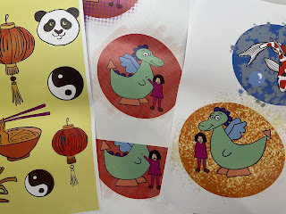
Reflection on last term

Image
As I am finishing my last term at DMUIC it is time to reflect on the work I created this term and overall on my time spent at the college. This term went quickly. My major project was to create children’s book and I devoted most of my time to it. I have chosen to create a children’s book because I enjoy doing bold illustrations and using vibrant colours. However, I do realize that my style is simple, and I have to learn more and train my hand more in graphic design. As a child I liked reading books but later they weren’t present in my life. However, for 3 years now I have adored reading again and wanted to introduce my hobby into the project. I chose the topic of Oriental Surprise because I thought it would give me an opportunity to use dramatic, contrasting colours and also because I was excited about exploring other cultures and their attitude to illustration. In previous term I focused on renowned illustrators in European history and this time I felt inclined to search a little furt

Creating Keyring and Badge

Image
I found on amazon Craft-it Keyring Kit and Badge Kit to make at home.  They are Reusable, blank for my own design Badge Diameter - 55 mm I cut my prints and put it inside Keyring and Badge I enjoyed making them

Fonts in children books - Typography

Image
Typography for children Children learn reading letter by letter slowly putting them together to discover the hidden meanings. Each letter is new and important. The typeface for children's books should be friendly, inviting and simple and the letters should be big enough for them to read. The preferable shape of the letters is rounded. The text should be easy to read and long lines of text and all capital letters should be avoided. When children read, their eyes are not yet trained enough to jump from the end of one line to the beginning of the next one. Therefore, enough space should be left for them to find the next part with greater ease. The five main characteristics that are usually attributed to topography for children are:  - high x-height, which is the distance between the baseline and the top of the lower case line in a typeface; taller letters are more readable - large counters, which means that the empty spaces within the letters are big and make the letters easy to read

Patrick Caulfield

Image
Patrick Caulfield  (1936-2005) was a renowned British painter and printmaker who was born in London and studied under Jack Smith at Chelsea School of Art. He was inspired by modern artists such as Georges Braque, Juan Gris and Fernand Léger.  Caulfield's work is known for a reductive lines and the way he showed everyday objects steeped in colour. His images seem simple and every day but the colours ale contrastively bold. The subject matter that he was preoccupied with banal and his paintings often depicted vases, glasses, chimneys, tables. The outlines of these objects were clearly defined  with black line and the surfaces of the items were shown flat. He was interested in what is familiar to the audience. He often painted landscapes, still life and domestic life but rarely did his paintings show people.  Caulfield painted mainly in acrylic paint on canvas and carefully planned his paintings, first starting with a drawing. Patrick painted everyday objects which were very flat, lik

proces of creating presentation box

Image
How I created presentation box: Step 1 Designed Images on procreate Step 2 Printed Step 3 cut Step 4  glued with Pva glue to the box Final outcome Final outcome I also added colourful tissue paper for decoration